With fewer words to get your message across, writing effective short copy can be surprisingly difficult. Here are some UX copywriting tips to help you out.
Did you know that our average attention span is just 8.25 seconds? This is a decrease from 12 seconds in the year 2000 and scientists reckon that we now have a shorter attention span than goldfish.
While you might not think that this translates to your website or business, it actually has a drastic impact on the way that users interact with your website.
In fact, it’s estimated that the average page visit lasts less than a minute, with most users leaving after around 15 seconds.
That 15 second period is your window of opportunity to hook the audience and get them to stay awhile and listen.
This is surprisingly difficult to achieve. In fact, dwindling attention spans is a huge concern for marketers that are used to dazzling their audience with elaborate poetry and fanciful language.
Even this article might be skipped over by most people given its relatively long introduction and lengthy sentences.
Understanding the concept of UX
UX stands for user experience. It’s a term that is used to describe the user’s experience with your product, website, or virtually anything that they can use.
For instance, UX might describe the interface of your cloud-based service or it could involve your product descriptions. In other words, anything that your user interacts with is part of their experience.
From the moment a prospect discovers your brand to their first purchase, the entire process should offer an excellent user experience. It should be smooth, informative, and most importantly, not a hindrance.
Therefore, the goal of designing a good user experience is to gently ease your prospect into your sales funnel and ultimately leave them satisfied even after they’ve made a purchase.
What is UX copywriting and short copy?
With the concept of UX under our belt, it’s time to talk about how it relates to copywriting. Copy is the term given to written material that is used to advertise, describe, and explain your products and services.
As you might already know, copy appears everywhere in the sales funnel. From the initial advertisement to the product description and support knowledgebase, every piece of written content on your website can be considered copy.
Common UX elements that should have short copy
Here’s a list of common UX elements that most websites use:
– Product descriptions
– Labels in text bars (such as a search bar)
– Call-to-action buttons
– Mouse-over tooltips
– Error pages
– Fine prints
– Pop-ups
– Headings
– Navigation
– Shopping carts
– Instructions
– Company values (explaining where the products are sourced from)
How good short copy improves the user experience
Short copy plays a vital role in the overall user experience. It’s always visible and your customers constantly interact with it.
Due to its importance, you might be tempted to hire a professional copywriter or put a lot of effort into beautifying the text and making it incredibly descriptive while ensuring it flows well.
This is admirable, but remember what we mentioned at the beginning of this article?
Most people will only spend around 15 seconds looking at your website. With an 8.25 average second attention span, that’s even less time if they’re glancing over your advertisements.
This means that every word they read counts. If you spend an entire sentence building up suspense, they’re most likely going to move on and click something else.
This is where UX copywriting and short copy comes in handy.
Key elements of good UX copywriting
In comparison to regular copy, UX copywriting is all about conveying a message with zero words wasted. Every word you use should have a meaning and the flow of your text should be smooth and uninterrupted.
Your short copy should compel people to dig further into your products and entice them into learning more. Once you’ve snagged their attention, you can then move on to more descriptive copy.
But until they’ve expressed interest in your products, you need to focus on utilizing every word to its maximum potential.
Here are some of the most important factors to consider when writing UX copy.
– Don’t use complicated language–stick to simple words
– Have a casual and conversational tone
– Make use of your brand persona or personality
– Cut unnecessary words
– Use images when possible
– Show benefits first, describe features later
– Organize your content for skimming
– User clear headings
– Test your copy for usability
To help drive these points, we’ve put together a couple of interesting examples of effective real-world UX copywriting.
1. Short copy to entertain and break the tedium
We live in a very strict and formal world where most businesses tend to give boring, but informative, descriptions of their products and services.
However, we’ve been seeing more lively startups break the mold and creative approaches to the way they create product descriptions.
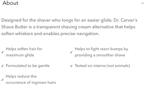
A perfect example of this would be from Dollar Shave Club, a relatively new business that takes a no-nonsense and rather comical approach to shaving products.

This is a great example of short copy being used to both entertain the reader and also explain an important philosophy of the company. The Tested on interns (not animals) line achieves four things:
– Breaks the common trope of bullet-point feature lists
– Adds a touch of humor
– Shows that interns use their products, displaying confidence in their brand
– Hints that the company is against animal testing
In just five words, we can extrapolate four unique points that help explain the product in greater detail. This is a fantastic use of short copy and shows how to condense multiple points into a single line with class.
In addition, the overall product description is concise and offers a no-nonsense approach to describing what it does.
2. Your credibility is important
Your audience loves it when you’re a trustworthy company and the best way to show that is to leave little snippets that remind them of your reputation.
A great example of this is Yelp’s review system. Reviews are great when they’re impartial, but these systems can easily be abused by removing reviews or tampering with them.

In Yelp’s case, their commitment to trust is a top concern. It’s bolded, the text is highlighted by the darker background and there’s even a link for the audience to click so they can learn more.
It clearly shows their commitment to their reputation and it’s the perfect example of how you can express your credibility with just a few words to offer your audience more peace of mind.
3. An honest FAQ
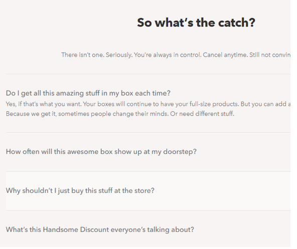
Using Dollar Shave Club as another example, an honest FAQ page is a great example of how you can create informative UX elements that explain your products and provide your audience with a reliable and concise source of information.
This particular FAQ is displayed at the bottom of the company’s home page alongside descriptions of the service and the products they offer.

Here are some key takeaways from this UX copywriting:
– The non-standard title of the FAQ imparts some personality to the content
– The subheading is conversational and straight-to-the-point
– The questions use simple words that make it sound like a conversation
– Short sentences are used to give a concise response.
– The questions are clearly separated and expand when clicked, saving a lot of space
Again, Dollar Shave Club makes an excellent case study for great examples of short copy.
An FAQ is essential to answer common questions that your audience may have, and presenting it in a concise and simple format like this can greatly improve the user experience.
4. Effective search bar labels
This is a simple UX copywriting trick that is used by almost every search engine. The example here is taken from the Tripadvisor website.

Here’s what you can learn from Tripadvisor:
– The search bar has a clear and concise title
– It’s supported by images that explain what the search bar is used for
– The label asks a simple question that fits the context of the website
– The added magnifying glass icon signifies that it’s a search bar
– No excessive words are used to convey the purpose of the search bar
One of the goals of excellent UX copywriting is to make it subtle enough that doesn’t detract from the experience but provides enough direction to help guide your audience around your website.
This tiny bit of text in the search bar is enough to pose a question and draw the user’s attention in a conversational tone.
Some final points
As you can see, UX copywriting can be an incredibly subtle but helpful way to improve the user experience across your website and ultimately the sales funnel.
These are four excellent examples of how short copy can be used to guide your audience to what they’re looking for, explain how your product works, and even inject some personality into your copy.
At the end of the day, the goal of UX copywriting is to keep things concise yet informative enough to fit the short attention span that most of your audience has.

Leave a Reply